Exhibitions.
TATE BRITAIN
Raphael Albert
Miss Black and Beautiful
The first exhibition I visited whilst at the Tate Britain was for the photographer Raphael Albert. All his images were black and white, each developed as gelatin silver print on paper. This gave the photographs the same glossy, shiny look, capturing a sense of vibrancy through monochrome film.
Albert was born on the Carribean island of Grenada in 1953 and later moved to London. He worked as a freelance photographer for Black British newspapers and went on to establish the local competition Miss Black & Beautiful and later developed more similar competitions celebrating Black beauty in the UK, and stayed photographing similar pageants all through the 1970s to the 90s. Albert eventually went on to found his own modelling school before passing in 2009.


FRAMELESS
I visited this exhibition with my grandma, completely unaware of what to expect. I was told it was an immersive exhibitions involving well known paintings, and I had no idea how this was going to be done.
There were 4 different galleries in this exhibition. The first gallery was titled 'Beyond Reality.' Upon stepping in, I was instantly amazed. The walls and floor were projected with dynamic surrealist and post-impressionist artworks and the floor, pillars and ceiling embedded with mirrors. Through animation and editing they were able to, in a sense, bring the usually stationary paintings to life. The animals and people painted moved; breathed, and clock hands would tick round the hours. The effect of this was quite disorientating at first, especially as it seemed like the floor was moving so it felt hard to balance!
There were 4 different galleries in this exhibition. The first gallery was titled 'Beyond Reality.' Upon stepping in, I was instantly amazed. The walls and floor were projected with dynamic surrealist and post-impressionist artworks and the floor, pillars and ceiling embedded with mirrors. Through animation and editing they were able to, in a sense, bring the usually stationary paintings to life. The animals and people painted moved; breathed, and clock hands would tick round the hours. The effect of this was quite disorientating at first, especially as it seemed like the floor was moving so it felt hard to balance!

|

|

|
The artists' works who were featured were: The Persistence of Memory (1931) and Elephants (1948) by Salvador Dalí; The Garden of Earthly Delights (c.1490 – 1510) by Hieronymus Bosch; The Tree of Life (1905) by Gustav Klimt; The Scream (1893) by Edvard Munch; The Librarian (1566), Winter (1563), Spring (1563) and The Waiter (1574), by Giuseppe Arcimboldo; Fireside Angel (1937) by Max Ernst; The Dawn of Venus (1922) by Thomas Lowinsky; and The Dream (1910) by Henri Rousseau.
|
The second gallery was titled 'Colour in Motion.' This included works from the Impressionists through to Neo and Post Impressionists. This gallery engulfed the viewer in, as the title suggests, colour! This was the most interactive of the galleries , as it had a surprising but brilliant feature of advanced motion tracking. This allowed for people to 'paint' themselves, for example when you walked on the floor the brush strokes from the painting being projected would move in the same direction. |

|
In this gallery the artworks included were: Starry Night Over The Rhone (1880) and Self-Portrait (1887) by Vincent van Gogh; Mont Saint-Michel Setting Sun (1897) by Paul Signac; The Waterlily Pond: Green Harmony by Claude Monet (1899); Portrait of Metzinger by Robert Delaunay (1906); The Garden at Bougival (1884) by Berthe Morisot; and A Sunday Afternoon on The Island of La Grande Jatte (1884 – 86) by Georges Seurat.
The third gallery was titled 'The World Around Us' and was the largest gallery of them all. This gallery really threw you into the centre of action of a painting, extending the whole canvas from the walls to the ceilings. The music playing always reflected the scene ahead. This was a very intense experience.

|

|
The works featured n this gallery were: Avenue at Chantilly (1888) by Paul Cezanne; Piazza Di San Marco (Late 1720) by Canaletto; The Rainbow Landscape (c.1636) by Peter Paul Rubens; The Fighting Temeraire tugged to her last berth to be broken up (1838, 1839) by J.M.W. Turner; The Wanderer above the Sea of Fog (1817) by Caspar David Friedrich; The Storm on the Sea of Galilee (1633) by Rembrandt; Tree Trunk surrounded by Flowers, Butterflies and Animals (1685) by Rachel Ruysch; London, Parliament, Reflections on the Thames (1905) by Claude Monet; Vesuvius Erupting, with a view over the Islands in The Bay of Naples (1776-80) by Joseph Wright of Derby.
Word 1- ARTIFICAL LIGHT

In photography there are lots of different ways to use and benefits of using artificial lighting. It can allow to you to create more dramatic contrasts within photographs, and add and completely change the colour of scenes. It allows you to play with the mood and tone of an image. I chose to explore artificial light as a strand as the bright colours and contrasts between light and dark are very visually appealing to me.
William Eckersley- Dark City

|

|
William Eckersley's 'Dark City' consists of a series of photos of artificial lights around London. The photos were captured over a period of four years. Eckersley's intention was to show a different side to London that is revealed at night, as the city in the day is usually extremely grey and dull crowded with people.
|
The photos being captured at night allow for a change from the busy scenes we usually see in London, the lack of people allowing the focus to be entirely on the structures of the city and the lights that accompany and showcase them. The photographs, which are presented in a photobook, consist of an array of bright colours from garish lights, specifically hues of pink, cyan and orange.
My response


Best edits

|

|
In the first photograph, I like the sharp contrast between the light and colours from in front of and behind the front seat. The back of the car is cast in shadow, with just a bit of the driver's head highlighted from the lights in front. I like the fluidity both images and think I presented artificial light in a striking and interesting way, capturing a similar vibrancy and contrast to Eckersley's work, despite the subject matters being very different. I looked towards Eckersley's work for more visual links rather than subject matter.
However, the photos I captured were more of snapshot moments rather than carefully set up and crafted pictures. I thought this would create a fluid feeling to the images, however upon reflection instead I feel it just makes them lacking in artistic and photogenic elements. Moving forward in future developments I need to pay closer attention to framing and composition before I take a shot.
Word 2- DYNAMIC
For this strand, I want to explore how movement is captured in still images.
Dan Witz

|

|
Dan Witz is a contemporary Chicago based street artist and hyperrealist painter. His project entitled 'Mosh Pits, Raves, Etc.' features a series of focused paintings of clusters of people at, as the title suggests, mosh pits, raves, etc. There is no foreground and background in the images, as instead the moving crowd of people fills the entire composition. The effect of this is a claustrophobic feeling of intense movement in the images, as that is all the viewer is able to see. This creates an extremely intimate experience for the viewer, as we find ourselves totally immersed in the hustling crowd in front.
Witz claims he found upon painting while trying to transition away from the rockstar lifestyle he was involved in during his 20s. The result saw Witz create these hypperealist canvas pieces, appropriately reflecting the adrenaline and chaos of tightly packed rock music crowds. The base for these paintings was captured by Witz attaching a camera to a pole at concerts, where he would raise the pole and camera to capture the crowds from within.
My response


Word 3- MIS-EN-SCENE
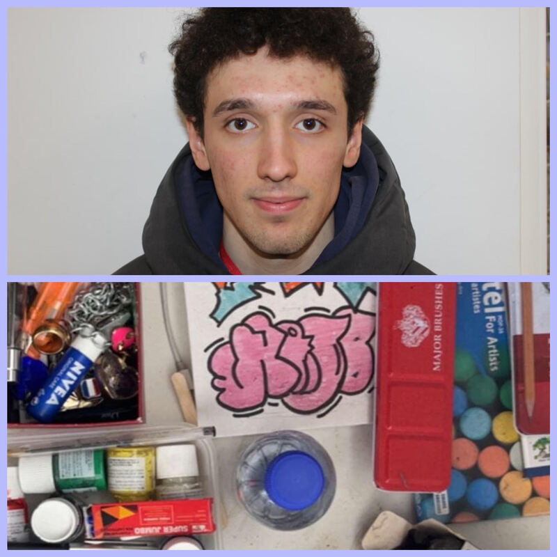
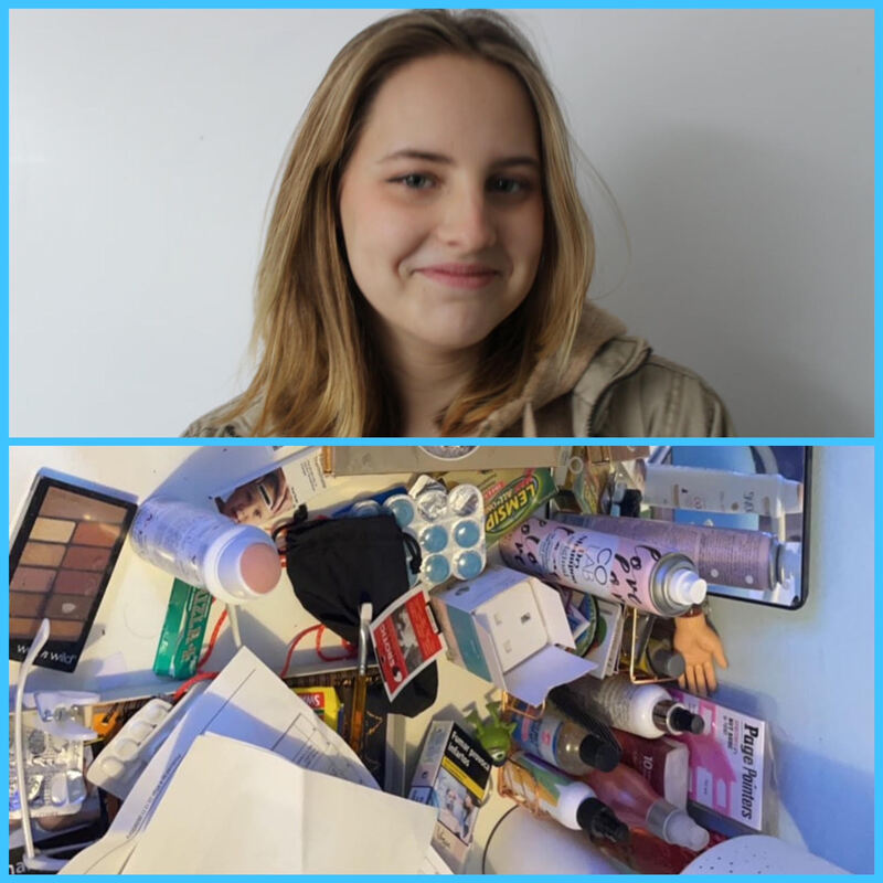
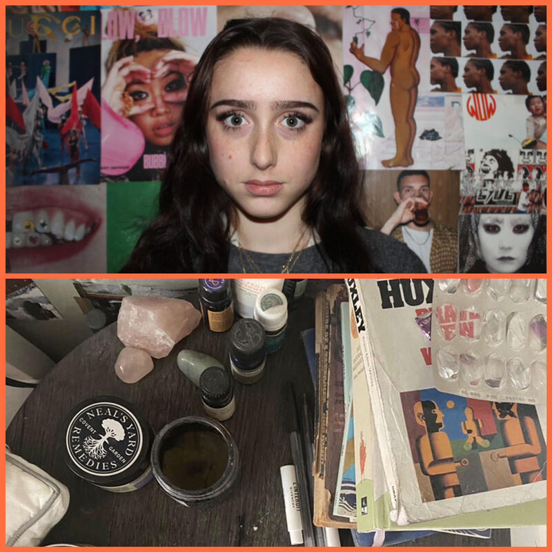
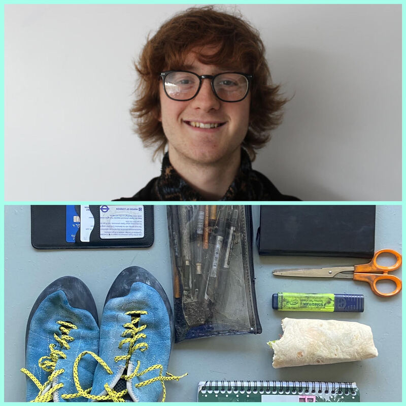
For this strand, I have interpreted the title 'mis-en-scene' by definition means 'the arrangement of the scenery, props, etc. on the stage of a theatrical production or on the set of a film.' I have interpreted it in a way where I can explore personal objects and how they can reflect one's identity. I wanted to explore the objects that make up people's private spaces, such as bedside tables or the contents of their bag.
Jason Travis
Jason Travis is a photographer from Los Angeles who's on going project 'Persona' is a photo series of portraits of people alongside the items they carry. Travis began this project in 2007, and since then has photographed over 550 people and their belongings! He sees these personal items of which we carry as manifestations of the self.

|

|

|
I decided I too wanted to photo people alongside their personal belongings to capture how our identity can be reflected in the things we own and have in close proximity and frequent use. As well as just photographing the contents of subjects' bags, I too took pictures of their bedside tables as well, as I feel this location and the items that are on it have the same level of closeness, importance and authenticity to a person as their bag items do. These objects found in these places are what we deem to be some of, on a daily scale, some of the most important things to us. Through the display of these objects, the viewer is allowed a snapshot into a stranger's life.
My response


I took pictures of classmates and their bedside tables/ the contents of their bag. I wanted to emulate the reflection of identity Travis captures in his project 'Persona.' I did this by displaying the portraits alongside their beloved items. To improve this set of photographs I should have done more planning into how the objects would fit into the collage as some of the image was lost once put alongside the portrait, as to fit in the frame.
Best edits
|
|
ARTIFICIAL LIGHT
I have decided to develop artificial light as my chosen strand to take further, as out of my three strands I found it to be the one I enjoyed most exploring. I liked the use of colour and shadow that is incorporated in the theme, and going further intend to explore the difference between artificial light in everyday life and artificial light in the studio.
Development 1
Still inspired by the work of Eckersley, I wanted to improve on my original set of photographs for the theme artificial light by putting much more thought into my composition and taking carefully crafted, set up shots incorporating photographic techniques I have learnt throughout the course. For my original development I took candid, snapshot like photographs which resulted in a lack of precision and artistic quality. Going forward for my first new development of the theme artificial light, inspired by the work of Niklas Porter, I plan to take more time setting up my shots, thinking carefully about perspective, composition and framing to create more interesting and artistic photos. Expand- what do you mean?
Niklas Porter
|

|
|


Best edits

What I liked about the composition of this photo was the difference in directions of the leading lines of the shapes. For example the 'money exchange' sign is pointing out more towards the viewer, whereas the other lines of the shopfronts are flat. It adds dimensions and depth to the image.
|

When framing this shot, I thought about the rule of thirds. I like the symmetry of this photograph.
|


I like the contrast between the vibrancy of the colours and brightness of the shop interior compared to the dull, muted tones that surround it. It creates a vignette effect, like having a frame within a frame. I think it makes the photograph eye catching as the contrast highlights the vibrancy of the heart of the picture, drawing the viewer's eye to there.
I liked the colour aspect of this development and want to keep experimenting and working with vibrant colours through later stages in my project.
I liked the colour aspect of this development and want to keep experimenting and working with vibrant colours through later stages in my project.
Development 2
For my second development, I wanted to move away from exterior landscapes and found artificial light, and instead manipulate the lighting myself for desired mood and effect. I was inspired by the work of Petra Collins and wanted to explore the theme of artificial light from her angle and take focused shots in the studio where I could control the light.
Petra Collins
Collins is a female artist, photographer, model and director. Born December 21 1992 in Canada, Collins is known for her vibrant, dreamlike photography and colourful portraits. Her contemporary and youthful approach to photography and filmmaking has landed her the role of director for numerous amounts of music videos for some of the world’s most famous singers. Her work centres around female identity and sets to recast women in powerful, positive roles.

|
|
|
These set of portraits are from her project ’24 hour psycho,' consisting of 10 large scale images of women in acts of distress. These focused close up portraits show the emotion of the women and addresses the idea of female hysteria. These photographs of girls looking sad and pensive, takes the concept of girl’s emotions to be shallow and self-indulgent to be powerful. This power is conveyed the composition (the frame showing just her face) and the bold vibrant colours.


Best edits

|

|

I tried to emulate the intimacy of Collins' photos by also choosing to take the portraits very close up, the subject's head taking up the entire frame. This closeness , as stated, helps to create a sense of intimacy between the viewer and subject. It allows for the focus to be sorely on the colours of the image, and the subject's face. The simplicity of the composition further allow for the main focus to be on the colours and lighting.
Development 3
For my third development I wanted to continue working in the studio where I was in control of the artificial light. I wanted to experiment with different shutter speeds and the effect it would have on capturing the movement of a light source.
Inspired by the work of Bosanko, I wanted to incorporate light trails into my project.
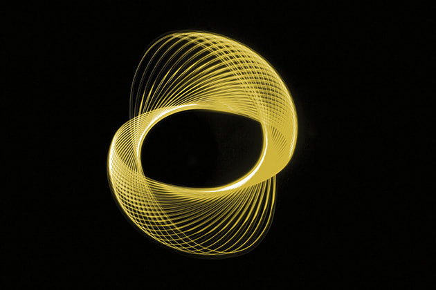
LIGHT TRAILS
Light trails are when the movement of light is captured in an image.
|

|
|
The technique of light painting is a type of long-exposure photography. The effect of this is essentially to be able to ‘paint/draw’ with light, as the long exposure captures the path of movement of the light source as a streak of light, or a light trail. A longer exposure means a slower shutter speed, therefore more light can be collected so when the light source is moving, the camera is able to capture how the light moves across the frame.
Michael Bosanko

|
|
Michael Bosanko is a light painting photographer who creates what he refers to as ‘light art’. His photos have a magical, surreal feel to them, featuring soft curved lines to make illuminated figures, shapes and letters out of neon lights. For Bosanko, a torch and its light is the same as paint and a brush. His portfolio of work is vast with his light paintings being of a varied subjects. Some include: album covers he recreates; famous pieces of art he recreates; ‘organic’ paintings where he creates images of different parts of nature such as trees or flowers; and writing and symbols.
Bosanko first encountered light painting in 2004 whilst taking landscape photographs of the moon. After accidentally knocking his tripod over, Bosanko discovered that the movement of the camera had turned the moon in a streak of light. Amazed with what he had accidentally created, he went on to try to write his wife’s name by manipulating the camera’s movement while pointing it towards the moon and succeeded happily. He later went home and repeated this technique with torches instead of moonshine.
Bosanko first encountered light painting in 2004 whilst taking landscape photographs of the moon. After accidentally knocking his tripod over, Bosanko discovered that the movement of the camera had turned the moon in a streak of light. Amazed with what he had accidentally created, he went on to try to write his wife’s name by manipulating the camera’s movement while pointing it towards the moon and succeeded happily. He later went home and repeated this technique with torches instead of moonshine.
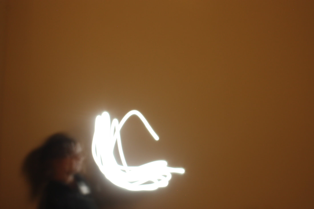
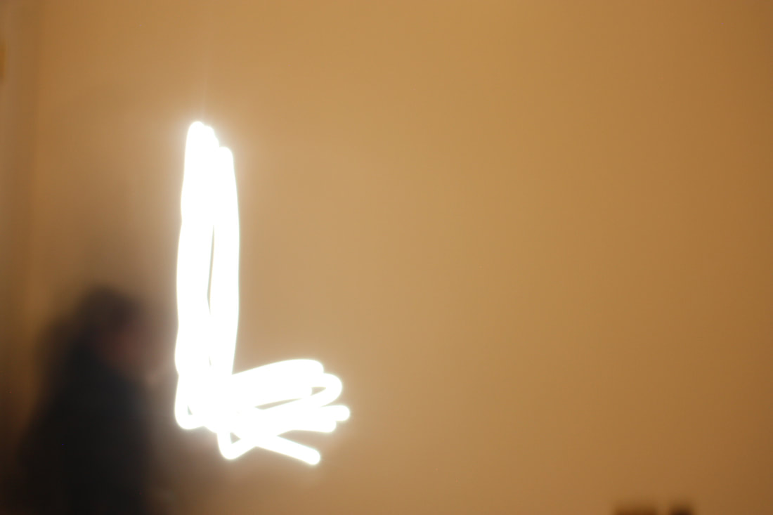
I liked the effect of this, capturing the light trails. I wanted to experiment with this technique too, using various different shutter speeds and see the varying effect this would have on the photographs. I went into the dark room and set up my camera and tripod. For the light source, I used a phone torch and covered the torch with thin sheets of coloured paper. Then quickly moved the torch around to create different patterns and shapes.


Best edits


I was pleased with how precise and clear the light trails were that I captured. The trails created defined shapes which were captured by the camera. There is little blur and there is a distinct difference between the background and foreground.
As this work was quite basic, going forward I intend to continue experimenting with light trails but take it into the environment, both interior and exterior.
Development 4
For my next development, I wanted to explore the effects of light trails further, this time in more natural environments and away from the studio.
Tokihiro Sato
Tokihiro Sato is a Japanese photographer, known for his playful interaction with light. He
creates surreal, poetic images which sensitively display unusual particles of light dispersed throughout black and white still landscapes, cityscapes and deserted houses. Sato trained initially as a sculptor, and the influence of his preliminary artistic schooling is evident throughout his later photographical works. He first tried out long-exposure photography to actually aid his sculpting work. This came about as a result of him feeling as if his sculptures lacked vitality and the ability to remark on the element of time.
creates surreal, poetic images which sensitively display unusual particles of light dispersed throughout black and white still landscapes, cityscapes and deserted houses. Sato trained initially as a sculptor, and the influence of his preliminary artistic schooling is evident throughout his later photographical works. He first tried out long-exposure photography to actually aid his sculpting work. This came about as a result of him feeling as if his sculptures lacked vitality and the ability to remark on the element of time.

|
The uncanny, supernatural feel of Sato’s work is created by the fact there are traces of life in his images but no living being in sight against the empty, neutral, arguably desolate backgrounds. In Sato’s own words, he ‘would like the viewer to see [their] idea of the “missing part” in my images. I want them to imagine that something which they cannot actually see in the picture does exist—by means of showing my own absence. My “respirations” and actions in the pictures are the essence of my own life, even though my body remains invisible.’ |
The photographs are captured using an 8 x 10 inch camera which is equipped with a darkening filter. The effect of this is the magnificent deep tonal range featured in all his images. Sato uses extremely long exposures, ranging from one to three hours, so he can move around the landscape and create the desired effect with his lights. As a result, the camera immortalises an activity that is not given the substantial shape by his body, but rather by the snake like trails of light which reflect his transitory existence. This causes the viewer to reflect on our own temporariness in life.
For nocturnal or interior views he “draws” with a small flashlight. The resulting photographs exquisitely depict detailed scenes punctuated by tiny pinpoints of light that track Sato’s movement, but not his physical form.

|

|
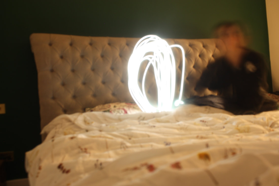
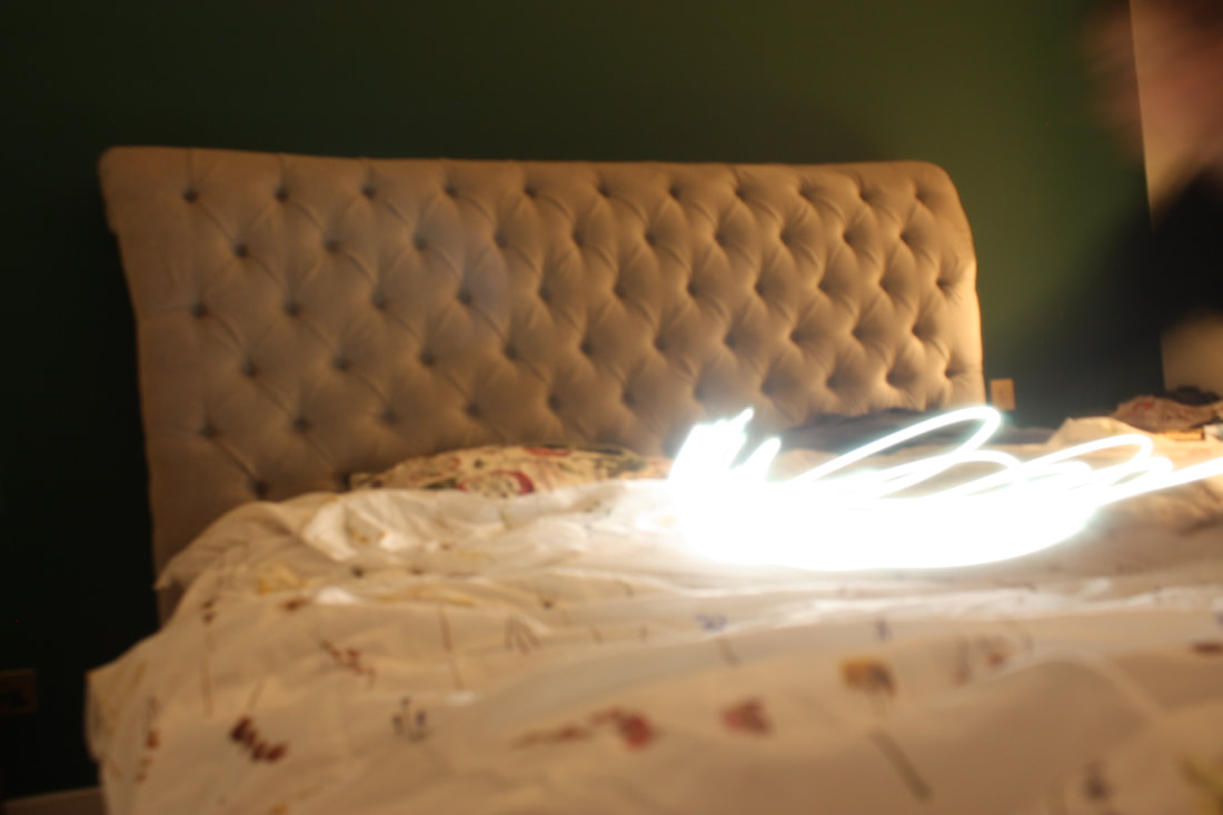
In my response I wanted to emulate the appearance of entities as seen in Sato's work, but more importantly recreate the feel of the transitory experience being captured. Like some of the images in Sato’s ‘Photo Respiration’ series, I took photos on a staircase. This involved running up and down the stairs, moving my torch in a way that mimicked my movements. The camera was attached to a tripod to avoid any movement. In this way, I was able to keep the background in focus.

|

|

|

|

Taking inspiration from Bosanko from the previous development, I experimented with letter writing and sketching.


Best edits


To create the image below, I collaged the pictures in which I made each letter onto one photoshop file. I then blurred the edges to create a smooth overlap. I then increased the saturation, contrast and exposure. I edited the hue then cropped. I was inspired by Bosanko's text pieces he creates with light trails.

Overall I really enjoyed responding to the works of Sato and Bosanko, however the main thing I struggled with this experiment was having to be both sides of the camera, having to manage the settings and hold the torch. Occasionally this would mean that some of the light trails go out of the shot and also issues with focus. Also in some of the photos the light trails are not as defined, but blurred into each other and it looks better when they are more defined.
Development 5
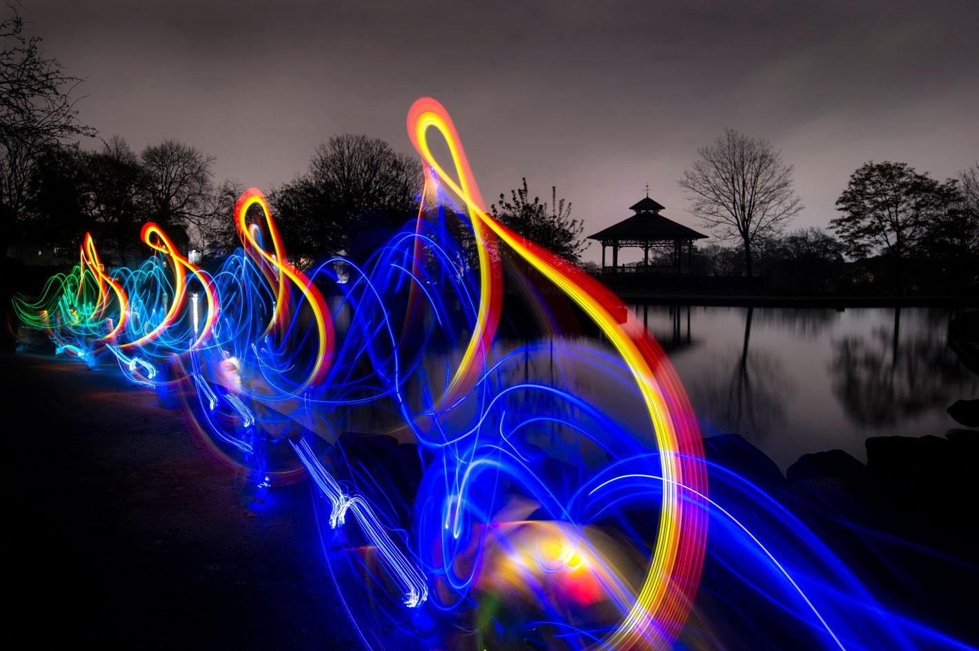
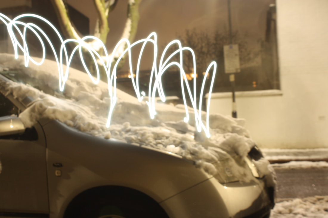
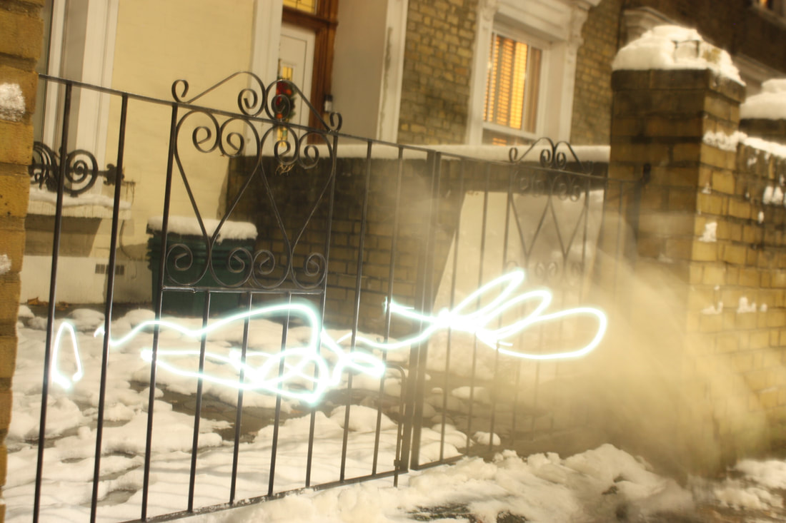
For my fifth development, I wanted to continue experimenting with light trails, however this time in an outside environment.
To take these photos, I set up a tripod and my camera and went to Archway road. I chose this location as it is a very busy main road therefore there would be many cars goings past quickly, perfect for capturing lots of clear light trails.
My camera was on the TV setting, ISO on 100, kept my shutter speed slow and then experimented with different apertures with different shots depending on where I was positioned and what the lighting was like.


Best edits
When editing these photos, I increased the saturation, vibrancy and contrast of all of them, and then experimented with altering the hues of each individual images to achieve different effects.

This is my favourite of my photos because of how pronounced the light trails are. The car as well had just approached a red light so was stationary while the majority of the shot was being taken. This allowed for the car to be in focus with the light trails behind showing the movement it had just done when approaching the traffic lights.

When taking this picture, I decided to experiment to see what happened if i took the camera off the tripod and moved it around. Here, it is not the light source that is moving like in the other pictures (which capture mainly moving vehicles). Instead the light trails are being created as a result of the moving camera; the light source (traffic lights) are stationary. I liked the effect of this and liked how abstract it looked. I also was pleased with how defined the light trails were.
|

I like how this photo has an extremely dynamic feel. This is created by not only the light trails, but by the blurred vehicles which show movement. The high exposure emulates the flashing of car lights and combined with the viewpoint being positioned between two roads, makes it feel like the cars are speeding towards the viewer. The positioning of the camera between the two roads of opposing traffic immerses the viewer in the photograph.
|
Development 6
Marilyn Henrion - Patchwork City

Marilyn Henrion is a contemporary American fine artist. Her project 'Patchwork City' is a series of collages made up of strips of different digitally enhanced city scapes. The collages are mounted against wood or canvas. The colourful and playful nature of Henrion's work sets out to reflect the vitality of city life, and the collaged architectures reflect the constant changing of the urban landscape.
I liked the look of the collage and wanted to try this in my next development.
I liked the look of the collage and wanted to try this in my next development.
First thing I did was to invert the photos of abstract light trails of traffic and street lights that I wanted to work with. To create the patchwork style myself, I then printed off the 2 images onto sticker paper, so the one photograph would be divided into 16 separate stickers.
I then mixed and matched different stickers to mix up the pattern of the images on one sheet of sticker paper.
I then mixed and matched different stickers to mix up the pattern of the images on one sheet of sticker paper.

|

|
Best edits
Best edits

After taking pictures of the collages, I increased the contrast and saturation slightly in photoshop so that the colours were more brighter and bolder, as much of the colour intensity had been lost during printing. I find the collages interesting and think the reordering of different sections of the original images create an interesting viewing experiences. I like how abstracted it is from what I originally was taking pictures of: traffic lights and cars.
Development 7
Going forward with my seventh development, I really liked the abstracted light trails taken from traffic and wanted to continue experimenting with them.
Davis Ayer
|
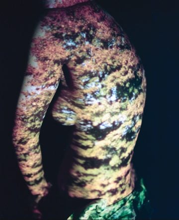
Davis Ayer is an LA based photographer, who's project 'Time Travel' projects vintage photographs onto posed naked bodies, acting as a contorted canvas for the images to wrap round. The images he projects are of varying subjects, from cityscapes to plants to rockets. He captures the projections on film. The overall effect is that of very dreamlike photographs with a nostalgic feel, as a result of the analog techniques used. The projections reflect memories of our past, like episodes of our lives casting over us. It creates a hazy map of personal experience.
|
|
To take these pictures I set up my model in front of a whiteboard, facing towards a projector. I projected the light trails against his face.


Best edits


I took a series of photos with my model positioned differently and different photographs being projected onto him. In some photos the model and the projected image are more merged into one, with the model becoming the background, but others are close ups where little background is visible, with instead the focus being on the light trails against the model's skin. It is interesting how the light trails bend with the texture and crevasses of his face. To improve these images I would prefer if both the background and foreground (model) could be in focus in the closer up shots, as I wanted to achieve a more smooth look where the model blends better into the image being casted.
Development 8
Development 8
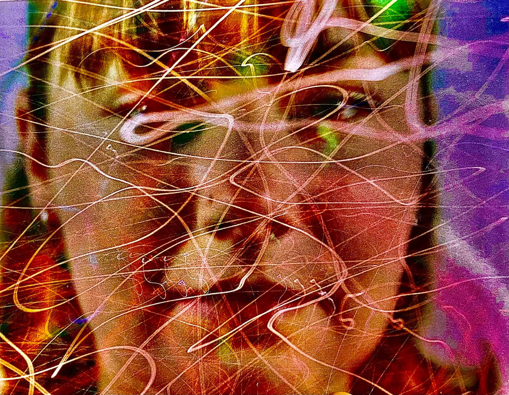
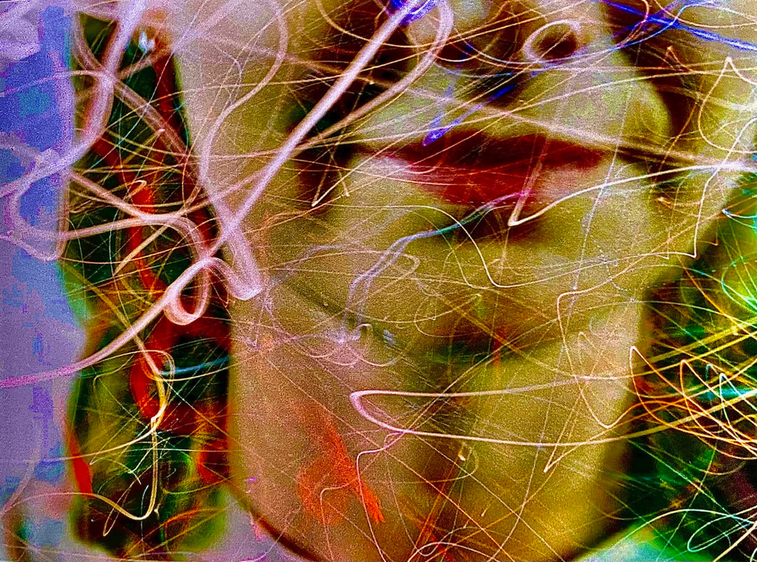
I really liked the look of my previous experiment with the light trails casted over a subject's face. I decided I wanted to explore this look further with a different medium. Instead I wanted to try in the dark room and use the technique of double exposure to get the layering of images.
I printed off a certain few of the abstract light trail photos and took some portraits of classmates and also printed these after inverting them on photoshop, printed onto acetate.
Light trails
These are the light trail images I chose to use for my double exposure portraits.
Portraits
These are the portrait photos I took to overlay on top of the light trails.


I inverted the portraits using photoshop.

Developed photos


|

|

I enjoyed working in the darkroom and was happy with the outcome of the pieces, more so after I edited them. This allowed the contrast to be greater between the light trails and the portraits, which gave more depth to the photos. Going forward however I would like to reintroduce colour into my work.
Development 9
I wanted to incorporate colour into the pieces of my prior experiment, and was inspired by the work of Daniele Buetti.
Daniele Buetti
|
Buetti is a contemporary visual artist from Switzerland, who works using a range of different mediums, such as installations, photography, performance and sculpture to name a few. In his series of perforated light box photographs (one of these shown to the right), Buetti tackles the concepts of beauty standards; sex appeal; the value of art, and more. These light box pieces, along with Buetti's photo-scarifications, act as a critical response to market-driven consumerism and pop culture perfectionism that is so prevalent in our modern world. These works incorporate photos of fashion icons such as Kate Moss and other top models pierced with many holes that glow from behind. Using his piercing technique the artist carves words and questions that deface the figure in the photo but at the same time calls attention to other forms of abuse. The effect of using popular images to do his work on is that the viewer, recognising the original photograph or the faces on it, can then access his work on an emotional level rather than an intellectual one, due to the sense of familiarity.
|

|

Inspired by Buetti's perforated light box photographs, I went over the streaks of light trails on my darkroom developed photos with a pin, piercing holes in the image to allow the light in. I then placed the pictures on top of the lightbox.
To add colour I then placed coloured paper between the lightbox and the photograph.

I found unfortunately that placing a coloured gel over the light box did not create a bright enough coloured light to get the desired effect. This also could have been due to the thinness of the dark-room photo paper.
Development 10 (final piece)
Development 10 (final piece)
For my final piece, I wanted to incorporate all my favourite elements from my previous developments and photographer influences, and produce work of a bigger scale. I decided to try a new medium as well by using a film camera rather than digital. I really liked the abstracted light trails I had taken of the cars and traffic lights, and wanted to continue exploring this further.
Using an SLR camera with a colour film, I took a series of close up portraits of my classmates. I took some of their full face and shoulders, and other more zoomed ones focusing on certain features such as ears or smile.
I wanted to work with overlaying light trails on top of portraits again, and as this time i was using a film camera this involved removing the film, rerolling it and taking another set of 24 photos on top of the portraits. Previously I had created overlays with a projector when I worked on a digital camera, and after that by doing a double exposure when working in the darkroom.
I wanted to work with overlaying light trails on top of portraits again, and as this time i was using a film camera this involved removing the film, rerolling it and taking another set of 24 photos on top of the portraits. Previously I had created overlays with a projector when I worked on a digital camera, and after that by doing a double exposure when working in the darkroom.
Once the roll of film had been reinserted, I went to Holloway Road to take long exposure photographs of the traffic. I put the dial onto the TV setting and set my shutter speed at 30 seconds. However so the light trails would be abstract I moved my camera around instead of keeping it stationary. I also took some photos of the coloured light bulbs in Nag's Head market in this way.


I was happy with aim of overlaying of the two images being successful, however I did not like how muted the colours were and the lank of contrast with the light trails against the subject's features. Therefore to enhance these differences and colours, I increased the saturation, contrast, exposure and the hue on photoshop. I finally got these edited images printed on 12" x 18" gloss paper.
Best edits

|

|


|

|
In creating my final piece, I did find that I struggled more at first with using an analog camera than a digital, as it took me longer to familiarise myself with the settings and to adjust the shutter speed in order to use a long exposure to capture the movement of light across the frame.
