
|
|
The Exposure Triangle
The exposure triangle is a diagram documenting the relationship between aperture, shutter speed and ISO.
|

|
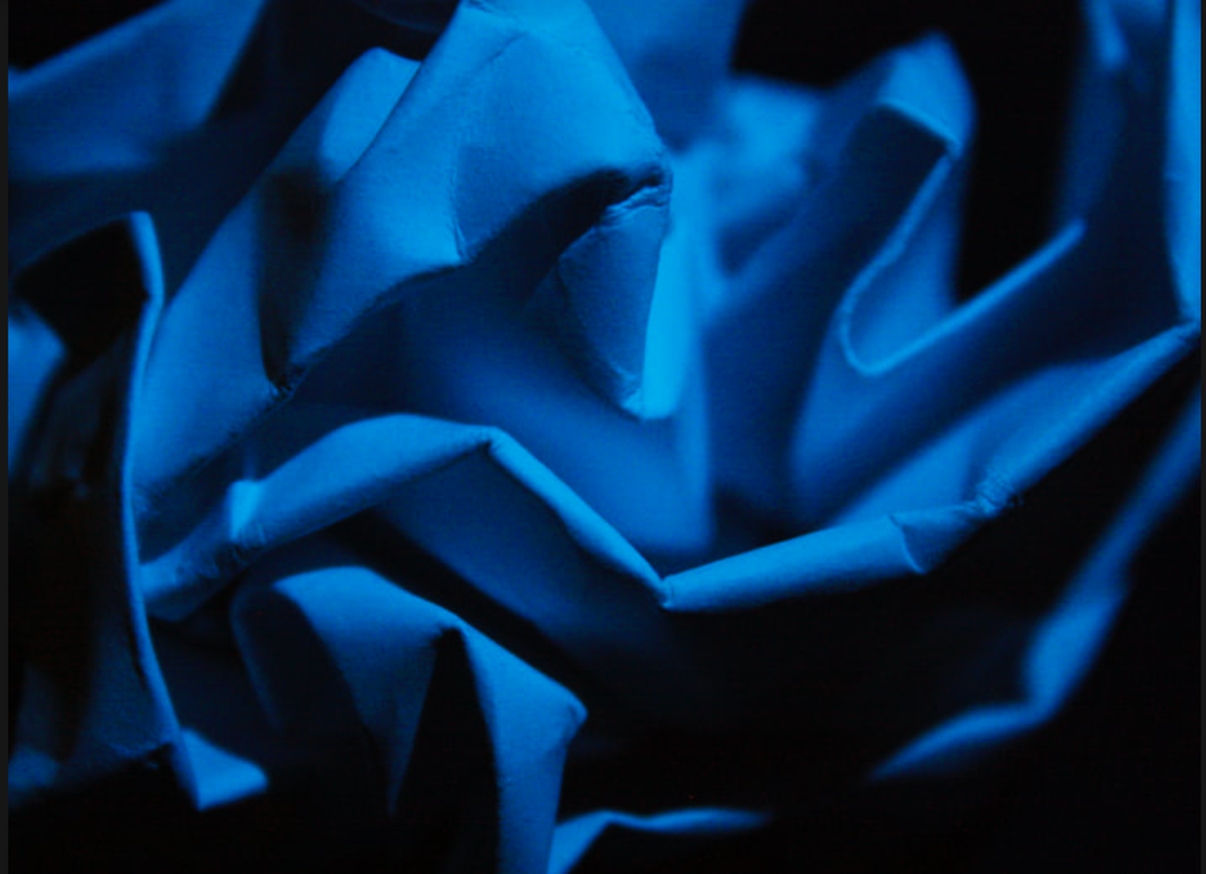
White paper test
For this task, we had to fold and manipulate at first just white paper against a coloured background, creating interesting shapes without being allowed to cut or rip the paper. Using a torch, we brought in a beam of light and put it in different positions. The folds and bends of the paper combined with the beam of light created shadows across the paper and the background. To create more variation in my images, I used different coloured paper as well.


Best edits:

|
|

|

|
I chose these four images as my favourites to touch up on photoshop, because I thought they had some of the most interesting compositions and use of light and shadow. I turned up the contrast slightly in the images and the saturation, but overall the final version of the pictures is very similar to the original photos as I dont think they needed much correcting.
Abstract development 1
Jarroslav Rossler

|
Jaroslav Rössler (1902-1990) was one of the Czech avant-garde photographers of the first half of the twentieth century whose work has only recently become known outside Eastern Europe. Czech photography in the twenties and thirties produced radical modernist works that incorporated principles of abstract art and constructivism; Jaroslav Rössler was one of the most important and distinctive artists of the period. He became known for his fusing of different styles, bringing together elements of symbolism, pictorialism, expressionism, cubism, futurism, constructivism, new objectivity, and abstract art. His photographs often reduced images to elementary lines and shapes that seemed to form a new reality; he would photograph simple objects against a stark background of black and white, or use long exposures to picture hazy cones and spheres of light.
|
My response

|

|

I created my response to Rossler by cutting up sheets of white paper, cutting shapes into them and make folds. Then with a torch, I shone a light through it against a white background. The shapes and curves cast an interesting shadow against the background. I struggled a bit with the cutting to make a shape that created a shadow that I liked, as I found it quite fiddly and occasionally the shadows were too vague / boring. The closer I held the torch to the paper, the stronger the shadow casted. I played around with the position of the torch to change the shape and position of the shadows.
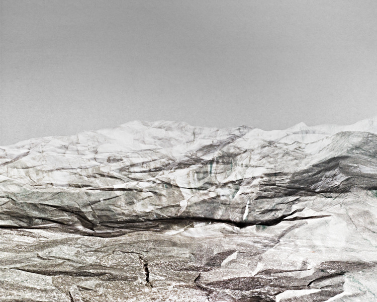
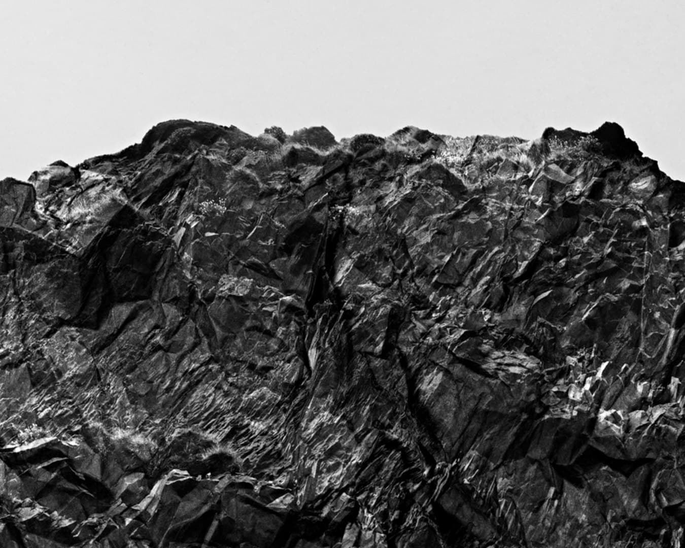
Abstract development 2
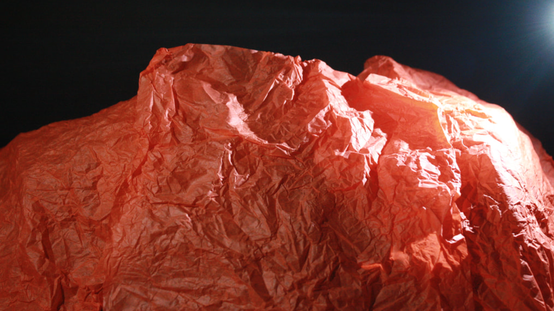
Brendan Austin - Paper Mountains

|
|
|
Brendan Austin was inspired by the mountain side while walking down the New Mexico border in the United States. His project Paper Mountains reflects the landscape, emulating the shape and texture of the rocky mountains through simply scrunching up thin tissue paper. The creases resemble cracks and bumps in the rocks. The photos are cropped so you cannot see the edge of the paper, allowing the paper to look like the mountains.
My response
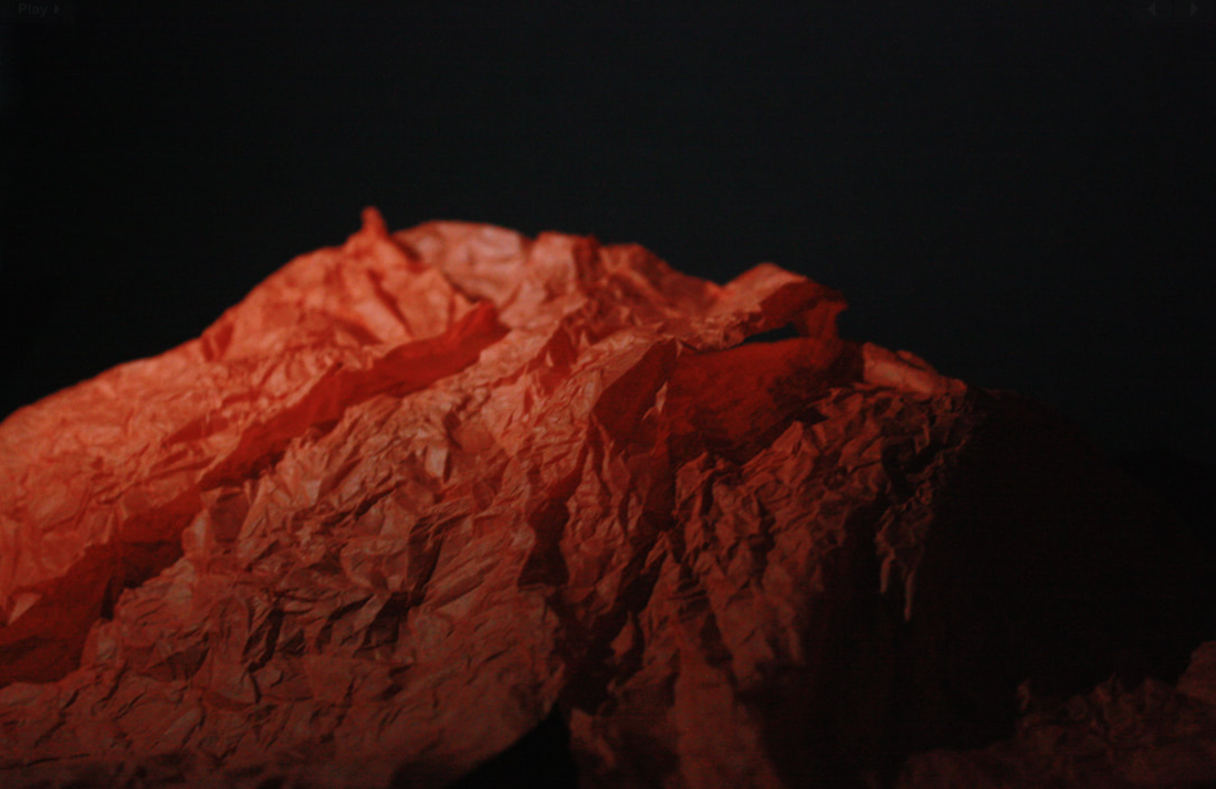
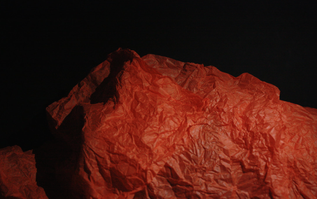
Like in the white paper test, I used a torch to cast shadows across the crumpled tissue paper. I was happy with the outcome as I think it resembled Austin's work and the image did look like that of a mountainside.
Ordinary to extraordinary
Edward Weston
Edward Weston was an American photographer known most for his still life photography. The dramatic shadowplay of his black and white photos of fruit and vegetables starkly contrasts the highlights and the shadows, and emphasises the texture of the objects. The dramatic lighting creates depth and gives character to the still life objects. As the subject of the photographs is simple, just one fruit or vegetable, it becomes obvious that Weston's focus is not on the object itself but rather how light and shadow sculpt the subject.

|

|
My response:


Best edits:
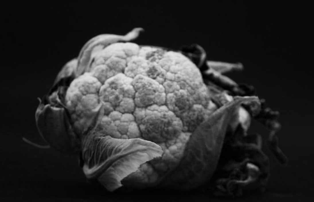
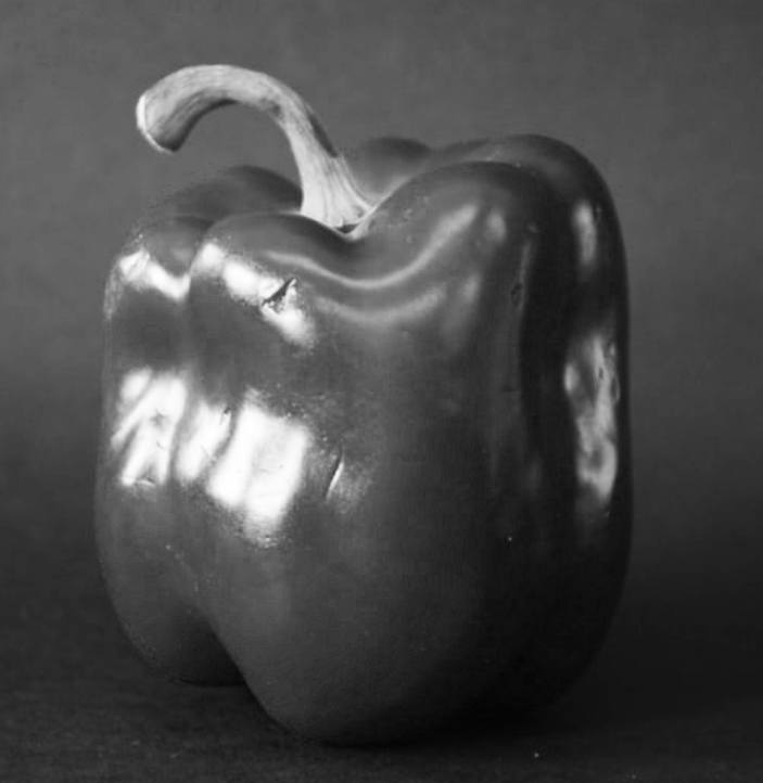
Using photoshop I picked three of my favourite images and turned them black and white, and then played with the RBG adjustments to get more dramatic shadow and lighting. The pineapple image I am particularly happy with as it is crisp and intense like Edward Weston's work, however the quality of the cabbage is slightly out of focus. The pepper I think has a good and interesting example of shadow and highlights, with lots of white light reflecting off the vegetable. The background is slightly too light and therefore visible, distracting attention slightly away from the object. I tried to fix this in photoshop but struggled with the tools. Overall I am happy with my response.
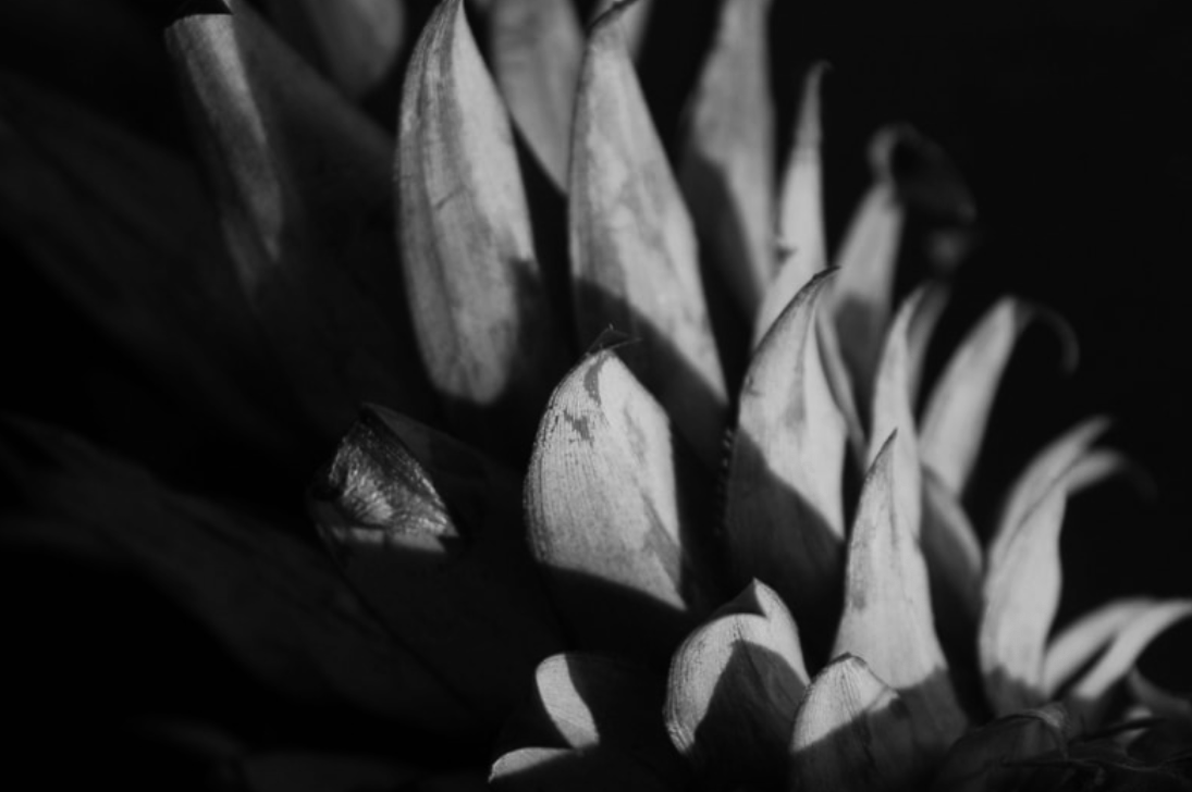
Abstract comparisons- Body and Nature
Alicja Brodowicz

|

|
Alicja Brodowicz is a polish photographer who's work focuses on the similarities between the human body and nature. She does side by side comparisons of photographs taken from the natural outdoors, and different parts of the human body. As shown in the example, she compares a stalk with thorns on it to a person's spine. The pictures are black and white which allows the viewer to focus on the shape and textures, rather than colours. The lack of colour as well provides an air of simplicity to the photographs.
My response
I went around the woods and tried to find different parts of the scenery that resembled parts of the body.


Ambiguity
Johnny Kerr
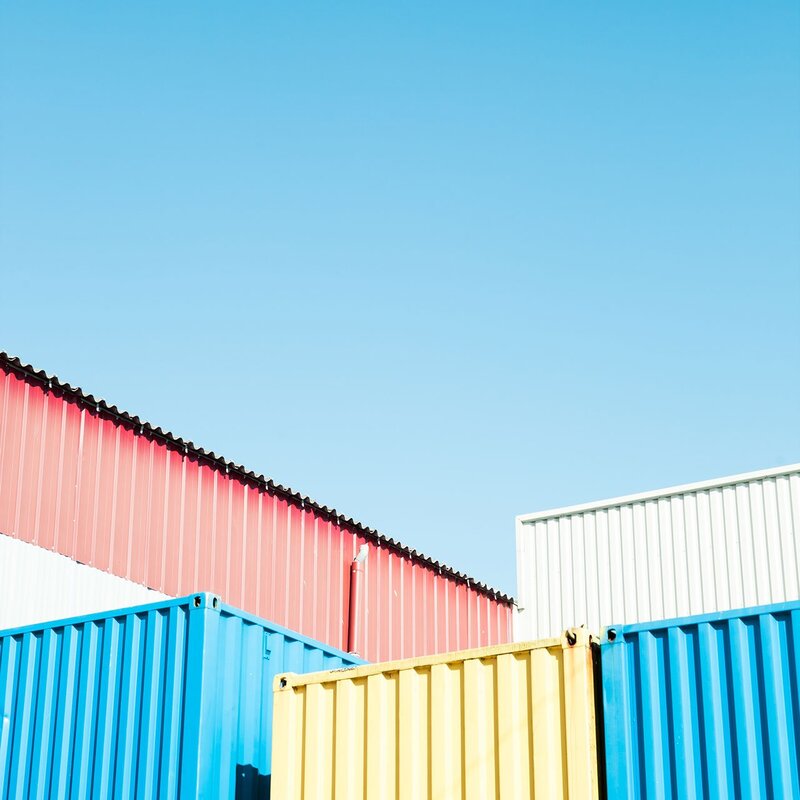
Johnny Kerr is an American photographer known mostly for his abstract and minimalist photography. Some of his inspirations include Picasso the filmmaker Wes Anderson. His project Ambiguity consisted of a selection of buildings in Arizona, all with straight sharp lines and lots of corners. The colours are simple, contrasting, and pastel.

|

|
Matthieu Vernot
Vernot is a French photographer born in 1979. His photographical work stems from his strong desire to re discover his home town Brest in Brittany. His work, similar to Johnny Kerr's features lots of strong lines and edges of buildings with block colour. He only photographs when the weather is good, as to have a stark blue background provided by the sky.
|

|

|
My response:

|

|

|

|
First I went around the school, looking for areas inside and outside the building with strong lines. For homework I then travelled to Chalcot Square in Primrose Hill to photographs the houses there. I picked this location because of the colourful houses. The structure of the houses created nice sharp lines and gave different sections to the composition. The lines of the walls, windows and balconies emulated the distinct edges of the two artists I was responding to, as well as the big blocks of colour. I further edited two of the images in photoshop, to simplify the colours.


After photoshop manipulation:

|

|

|
|
I simplified these images using photoshop. First, I would use the polygonal lasso tool to select which area of the image i wanted to work with. Next, I would press the fill button and select a colour from the photo that I wanted to fill the selected area with. The first image I found quite easy to do edit as the photograph was simpler, with less lines and colours. I struggled more with the second as the composition was more complicated and needed to find the right balance between simplifying the image and still being able to tell what the photo was of.
Abstracting the environment
Saul Leiter

|

|
My response:

Stephen Calcutt

|

|
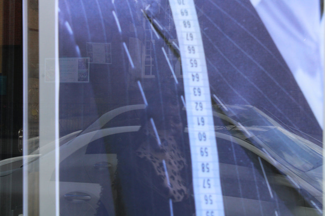
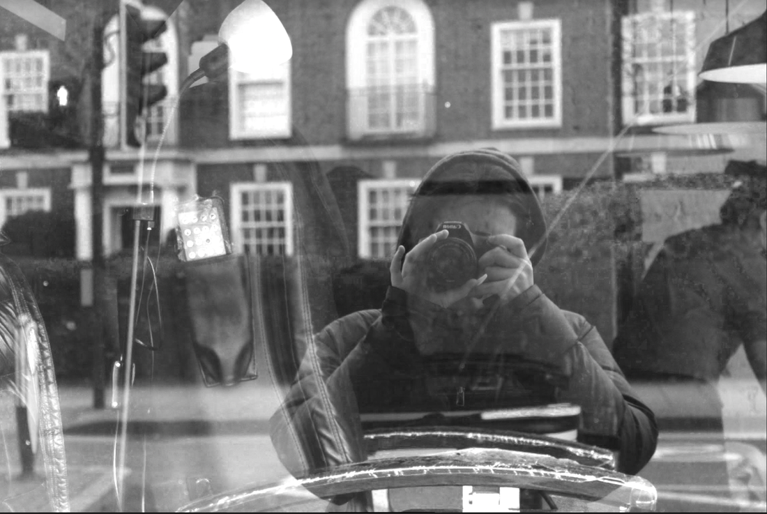
Stephen Calcutt is a contemporary british street photographer, whose work features him travelling around the city of Birmingham capturing scenes at bus stops and other types of urban shelters. He uses the windows of the bus stops as a lens, obscured slightly by graffiti marks and etchings. Behind the windows are city settings, sometimes with people candidly caught going about their day. The colours are bright yet mainly cool, reflecting the classic cold british weather.
My response:
Like Calcutt, I used the windows of shelters as a lens. I took photos through various telephone boxes on Muswell Hill Broadway.


Best edits:


I chose these two pictures as I liked the composition the most. Using photoshop, I enhanced the vibrance, saturation and the blues of the image to reflect Calcutt's work and capture the similar urban feeling in my photos. The graffiti, dust, stickers and other things on the window added depth and texture to the images.
Lee Friedlander
Lee Friedlander

|

|

|
My response:


Best edits:

Chemigrams
Strand 1- Architecture- colour simplification
For my first strand of independent development, I want to do a development on the works of Johnny Kerr and Matthieu Vernot. Both their work focuses on architecture and geometric abstraction. They have a strong use of colours against a contrasting backgrounds, and focus on geomtric shapes found in buildings.

by Matthieu Vernont
|

by Johnny Kerr
|
I went to Central London to photograph the skyscrapers there. I chose this location because of the sharp and interesting shapes of these buildings. I used the blue sky as a background, same as the artists I was inspired by.


After taking my photos, I simplified the images on photoshop to create areas of block colour. I felt this really help to emphasise the geometric shapes of the buildings. I did this the same way as I did for the ambiguity task, using the polygonal lasso tool the select areas and then fill them with a certain colour. Once again it was hard to find a balance of simplifying the image enough, but also not too much as to lose all definition of the photograph.
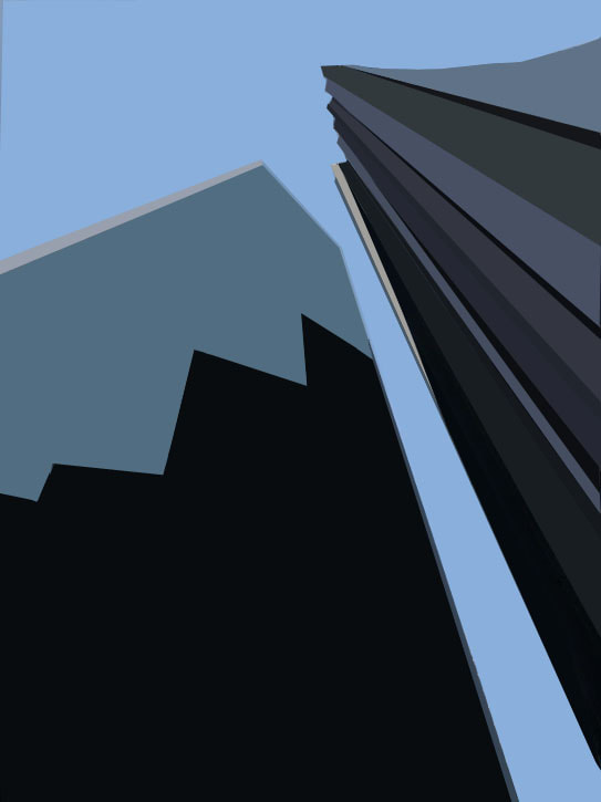
I was pleased with the outcome, however I didn't want to waste the detail of the original photos so looked into another artist, Michael Shainblum, whose work I could respond to without having to simplify my pictures.
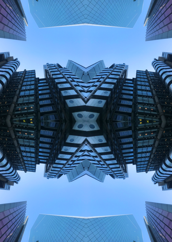
Michael Shainblum
|
|
Michael Shainblum's project 'Mirror City', created in 2014, is a timelapse video of five major American cities: Los Angeles, Las Vegas, San Fransisco, San Diego and Chicago. The videos were taken first in original form, then duplicated and flipped horizontally and vertically to create kaleidoscopic visuals. In his own words, "I wanted to put man-made geometric shapes, mixed with elements of color and movement to create less of a structured video, and more of a plethora of visual stimulation."
|

|
